


Beyond Bloomberg: The Invisible Curve of Power
Inside Wall Street's Hidden Data Moats

My first post discussed why Bloomberg killers are dead on arrival and why Bloomberg’s $13bn empire stands unshaken. It explored how they built formidable competitive advantages, dug insurmountable moats and cornered some prized assets. But I only gave you half the story. The other half of Bloomberg's dominance lies in them mastering the invisible curve that underpins the entire financial data industry.
As financial data journeys from creation to consumption, it flows through a value chain that forms the nervous system of modern markets, transmitting millions of signals through a complex yet structured system. This system comprises dozens of fragmented yet specialized firms, each playing a distinct role. Some firms function as sensory organs, turning market activity into price signals firing across global exchanges. Others operate like neural nerves and pathways, transmitting market information – from corporate filings and annual reports to economic indicators – gathered from every corner of the global economy. Further along, specialized neural centers process this cascade of information into refined insights and analytics that drive trillion-dollar decisions.
Yet Bloomberg has achieved something remarkable: they own integrated assets across every stage of the value chain, forming a powerfully interlocked and seamless whole - from data production to distribution to analysis. Understanding their endgame to control the end-to-end value chain reveals not just their business model but also the fundamental economics of every player in this $40bn+ industry.
This value chain offers a fascinating window into modern capitalism's decentralized nervous system – the financial data industry. One that presents a captivating crypt of contradictions. Despite being built on public information, it generates extraordinary private value. Despite intense competition, it still creates natural monopolies. Despite heavy regulation, it attracts a constant stream of entrepreneurs. It's both ancient in practice (prices have been recorded for millennia) and cutting-edge in delivery (microsecond price updates). It's a battle of the risk-averse executives manning mission-critical infrastructure against the risk-taking entrepreneurs trying to capture outsized value, pitting mathematical precision against human judgement. This crypt, I assure you, is worth unlocking.
To find the key, we'll follow the journey of financial data from its moment of creation to final consumption, and in doing so, map industry players, their economics, the market structure and its dynamics.
While this may appear dauntingly complex – a maze of data, feeds, platforms, and proprietary systems - we’ll strip away the technical jargon, start with the building block and stick to familiar examples. So strap in. We'll be breaking new ground. And don't worry – we'll get through the rest of this post without mentioning Bloomberg! Instead, we'll use three peers to decipher the industry's unique ecosystem.
Three Points of Control
While well known, these peers create and capture value in entirely divergent ways across three distinct stages. As market leaders in their respective domain, each firm exercises a different point of control over the data that passes through them, and their business model exemplifies the unique properties of each stage they represent. The three stages being:
Production: Where raw financial data originates, exemplified by CME Group – the world's largest derivatives exchange that processes an astounding $8.4 trillion in daily interest rate futures alone. Producers, like CME, add value by extracting raw data as a byproduct from their trading operations.
Distribution: Where data is aggregated, transformed and delivered, illustrated by FactSet – which performs the crucial but complex task of collecting and standardizing data from 850+ sources and offering it to 200k+ users. This middle stage adds value by organizing raw data and packaging it into usable information.
Activation: Where information is analyzed and converted into proprietary insights, demonstrated by MSCI – whose indices have become the standard benchmarks for over $16.5 trillion in equity assets globally. This stage adds value by adding meaning and context to existing data1.
Together these stages take a peculiar form, fitting into the 'invisible curve' as the title of this post suggests. This curve governs how value accrues disproportionately at the ends of the chain (Production and Activation) compared to the middle (Distribution). This value capture will be strikingly evident through some metrics we'll assess for each of the three firms. Firms you may already be familiar with - by working in the industry, as a shareholder, or by being unusually curious. Or, like me, all three. But even if you're new to financial markets, this post will serve as an accessible guide to understanding what makes the financial data industry tick and how they make their billions.
The post is structured as follows:
In Part I, we'll first classify the various types of market data and some of their attributes. We'll then familiarize ourselves with the three firms and understand their role in each stage. We'll examine their business models, decode their moats, and reveal the market forces influencing value creation and capture.
In Part II, we'll be introduced to the invisible curve that best represents each stage's economics and constraints. We'll look at some metrics to confirm the curve's existence and form. We'll also synthesize some inherent properties of these firms that could extend to the stages they represent.
We'll then summarize the properties of the three stages to guide us in future posts, and postulate where it could be applicable.
But before we dive in, here are a few important notes on our approach:
Data, Information, Insights: Throughout our journey, we'll treat data as raw, unprocessed signals, information as processed and organized data, and insights as analyzed and synthesized information. This simple hierarchy will help us track value creation at each stage.
Pure-Play Champions: CME, FactSet, and MSCI are our featured companies. These "pure-plays" excel in their respective domains and, unlike their diversified peers, haven't made significant acquisitions recently that would muddy their financial stories. They offer cleaner case studies for understanding the economics of each stage.
Financial' market data', Not 'Financial Markets' data: Throughout this post, and indeed this substack, when we talk about 'financial data' or 'market data,' we're focusing on capital markets data - prices, yields, trades, and company financials that power investment decisions. It excludes the distinct worlds of payments data (what Visa collects), banking data (what JPMorgan processes), or insurance data (what Verisk analyses) that make up the broader Financial Markets data domain.
Position, Not Power: While our pure-plays have fascinating business models worthy of their own deep dives (and 7 Powers framework analysis), our goal here is different. We're using them to understand how different positions in the value chain lead to dramatically different economics. Where relevant 7 Powers emerge, they have been called out.
Inductive, Not Deductive Analysis: To keep this post focused and manageable, we'll first examine our three pure-plays and uncover evidence to support our framework. We'll then make observations that lead to some general principles. The inductive approach necessitates a narrow scope (to US-listed firms) and skips competitor analysis for a later date.
Part I: The hidden journey
How data and value travels across the ecosystem
1A: The building blocks – a loose classification of financial data
Financial data transforms in value as it travels through the ecosystem. It begins as raw market signals but evolves into valuable end products depending on how it is wielded. Like neural signals originating from different sensory inputs, financial data emerges through distinct pathways. And like neural pathways that convert simple sensory inputs into complex thoughts and decisions, each step of the data value chain creates new forms of meaning and value.
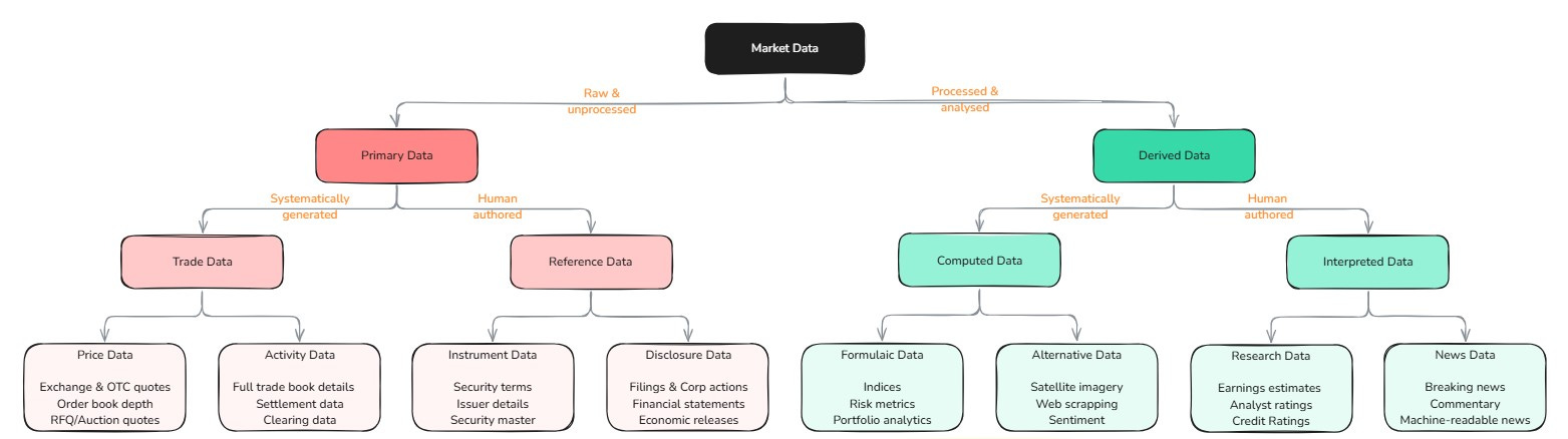
At its core, financial data follows a binary tree and comes into existence in dichotomous ways.
Primary Data emerges in the raw form almost entirely as a byproduct of other core business activities. It comprises of Trading Data, which includes everything from real-time exchange prices to OTC quotes and order flow, generated as a byproduct of trading activity, and Reference Data, which encompasses company filings, corporate actions, and even country-level economic statistics, all a byproduct of good governance forced by regulatory oversight. The two have differing economics drawing from ownership rights. Exchanges can monetize their proprietary trading data. On the other hand, reference data emerges as a public good, with producers (companies and governments) typically unable to monetize beyond basic access fees.
Derived Data then flips this model entirely - rather than being a byproduct, it is the core product. It creates value by generating insights and analysis on existing data. It manifests as Computed Data that captures human-engineered but machine-generated insights. These can be done through well-known formulaic methods (like indices) or black boxes that automatically process voluminous data (sentiment). Alternatively, it could take the form of Interpreted Data that requires ongoing expert-human judgment (like credit ratings, equity research or news2) to produce. The economics here differs because computed data can scale once designed, whereas interpreted data is constrained by the availability of ongoing human judgment3.
The economics of each data type follow distinct patterns that fundamentally shape business models across the industry. Trading data is perhaps the most dramatic, with value evaporating in microseconds, while reference data maintains its relevance with value accruing over time. Computed data accrues value as it becomes an industry standard, while interpreted data accrues value through the quality of its content. Going a level up, derived data producers monetize their data and their IP (their methodology & expertise), whereas primary data producers can only monetize their data. These differences lead to unique business model implications, which we'll discover shortly.
The above classification won't be found in a textbook, nor is it part of the industry parlance (maybe partially)– but it helps explain why some players capture dramatically more value than others in the financial data ecosystem. Exchanges own the means of production, giving them enviable positions as natural monopolies. Value also accrues when deriving new data, where activation can create entirely new categories. In between sits distribution, whose economics are shaped by the costly but essential work of standardizing and delivering all (eight) types of market data at scale.
These inherent properties of different data types create the foundation for the value chain. However, value chains only come alive through examples. Let's follow the three companies that have mastered each stage to see how these data dynamics play out in the real world.
1B: The Three Acts of Market Data
Financial data's journey from creation to consumption follows three distinct stages:
Act 1: Data Production - where CME turns tickers into tape
Global trading activity is mainly captured by centralized, licensed exchanges that match supply and demand for specific instruments and securities. CME Group is one such exchange (along with Nasdaq, ICE & CBOE), notable for operating the world's largest futures and commodities exchange. In this marketplace, traders speculate on everything from interest rate futures to live cattle contracts. However, while CME's primary business is matching buyers with sellers, it's also one of the world's most important producers of financial data.
How? Whenever two traders agree on a price, CME executes their trade for a fee, creating a data point. Millions of these trades generate a constant stream of price data. The exchange simply provides the mechanism to execute buy and sell orders. The participants 'create' the price when they agree on a trade, a price the exchange then gets to 'own' as a data point (the cornered resource). These data ownership rights – a byproduct of its core business – are a key advantage of operating an exchange. Another is the perpetual motion machine of price discovery. When CME executes a trade, the price ripples out to thousands of screens globally in microseconds. Traders react by adjusting their positions and orders, which creates new trades, generating fresh prices and data points – and the cycle continues (network effects). The constant price update leads to a continuous data stream. Together, these form a formidable moat that gives exchanges a dual income stream - transaction fees for each trade and licensing fees for the price data - double dipping, as you may.
CME's scale is staggering. $8.4 trillion worth of interest rate and $1.1trillion in equity futures change hands daily – more than the GDP of many countries. How is that even humanly possible? A question for another day. But HFTs, leverage and netting of margin capital have a lot to do with it. No such sums of money ever change hands.

Unfortunately, having direct access to this single firehose of pricing data isn't enough to make good trading decisions. The last traded price of December corn futures can only carry limited signals. CME's data feed, while necessary, isn't sufficient for a trader.
The price of corn futures isn't just affected by trades executed on the CME– it's influenced by weather reports from Iowa, export data from Brazil, shipping rates from the Baltic Exchange, currency movements in forex markets, storage costs at warehouses, inflation expectations, agricultural policy and even geopolitical events that could disrupt supply chains. A trader must synthesize information from hundreds of data sources to make informed decisions. But sources are diverse, dispersed and disjointed.
This complexity creates a crucial problem: who will gather all these disparate data sources, clean them up, and present them in a way traders can use? Enter FactSet, a Distributor. While CME indefinitely prints data from its exchange, FactSet, our next player in the value chain, tackles the messy challenge of organizing financial information from across the world.
Act 2: Data Distribution – where FactSet ordains order from chaos
Ingesting multiple fire hoses of data is backbreaking work. Presenting them in every format and frequency to a fluctuating and fragmented user base is just as punishing. Without a powerful financial middleware, it is bordering on the impossible. FactSet (along with Bloomberg’s Terminal & LSEG’s Workspace) is that middleware that channels and controls the distribution of an ocean of market data.
Distribution isn't simply about passing data along - it's about making it useful by organizing data into information. FactSet doesn't create most of its data, but they've built an incredible machine to collect, clean, sort, catalogue and deliver them to end users in a way that creates value (process power).
The value add happens in three sub-stages.
Aggregation – the collection layer
acquire and ingest first-party data from various sources (850 and counting) into common formats and standards
data collection by FactSet to support data discovery by the user
Transformation – the processing layer
Organize data into information by putting it through various enrichment loops (error correction, metadata tagging, joining different datasets, etc)
data processing by FactSet to support data querying by the user
Delivery – the application layer
present information in a frontend GUI where users can interact with and draw insights from the data
data application developed by FactSet to support data consumption by the user4
As part of the Distribution stage, FactSet does all the heavy lifting in exchange for a steadily increasing subscription fee. Through a unified terminal, they give users structured, categorized, documented, enriched information on all tradeable securities across global capital markets.
Users can track their investments across portfolios, analyze complex relationships between different securities, screen thousands of companies, generate comprehensive reports and make informed decisions based on clean, accurate data – all from a single application with well-integrated workflows (switching costs). The application provides a powerful lens into financial markets, but it's still just that: a lens. The real work for the user begins after the data arrives through the application.
Distributors primarily focus on organizing and delivering structured information with the necessary querying tools. So, while they provide the ingredients and the kitchen, users still need to cook the meal. They must still wrestle with the data, spot patterns in the noise, interpret what those patterns mean, and ultimately decide what action to take.
Distributors help users answer the question, "What is happening?" But many users need help answering the more challenging question: "Why is it happening? What does it mean? What can happen next? What should I do?" The next stage of our value chain is focused on answering these questions: Activation. By creating industry standards, methodologies, and frameworks for data analysis, Activators help users make sense of the information from Distributors. MSCI specifically helps answer the question, "Why is my portfolio under/overperforming?" through standardized indices.
Act 3: Data Activation – where MSCI turns industries into indices
At its core, data activation is about turning information into insight. While producers generate raw data and distributors make it accessible, activators add an analytical lens to create something entirely new – derived data that helps investors make better decisions. This value creation happens in two main ways: through computational activation, which transforms raw data into objective measurement tools (like indices) or mines non-financial data for hidden tells (like satellite imagery); and through analytical activation, which provides expert interpretation through research (like credit ratings) or market context (like financial news).
MSCI is a form of computational activation (similar to S&P, FTSE & Russell indices). It began by solving a simple problem: active managers needed an independent measure of their performance, a set of benchmarks that everyone was pegged to. Benchmarks could represent large geographies, countries, industries, sectors or themes. But what started as a steady business charging licensing fees for benchmarks to these "alpha seekers" transformed dramatically with the rise of passive investing. Suddenly, a new type of customer emerged – ETF providers who wanted to track indices with precision and were willing to pay a fraction of their AUM for the privilege. These "beta seekers" weren't trying to beat the market; they wanted to replicate it. MSCI set itself up to collect a micro tax on the entire market irrespective of the investor type.

Consider the S&P 500 - the most famous index5. By taking publicly available stock prices of America's 500 largest companies (representing 80% of the total U.S. market value) and applying a market-weighting methodology, a benchmark that now drives trillions in investment decisions is created. While most of the methodology is publicly disclosed, index providers hold back just enough to cloak their intellectual property.
What makes activation particularly powerful is
how it creates entirely new IP from existing data6,
once created, it can be adopted by anyone (scale effects) and
the more it is adopted, the more adoption it attracts (network effects).
Before we go further, and while you ponder where these trillions in indexed assets are hidden, let's clarify some key terms that will be crucial for understanding Part II:
An Index is a precisely weighted average of the price of a pre-determined selection of stocks. A benchmark is a widely adopted index that becomes the standard for performance measurement
Alpha represents how much better (or worse) an investment performs versus its benchmark. Beta represents the contribution of the benchmark's performance to the investment return.
Alpha seekers (active managers) try to beat the benchmark. Beta seekers (passive funds) aim to match the benchmark precisely.
Part I has hopefully established the three stages of the value chain and how data accrues value as it passes through each stage. Specifically, it captures the value-creation element of each stage. But, value creation does not lead to proportional value capture. Part II will establish where value capture is disproportional and uncover some reasons why. Value capture in financial data takes the form of an oft repeated pattern in other industries.
Part II: The Invisible Curve
How value is captured across the three stages of market data
A Stan-ding observation
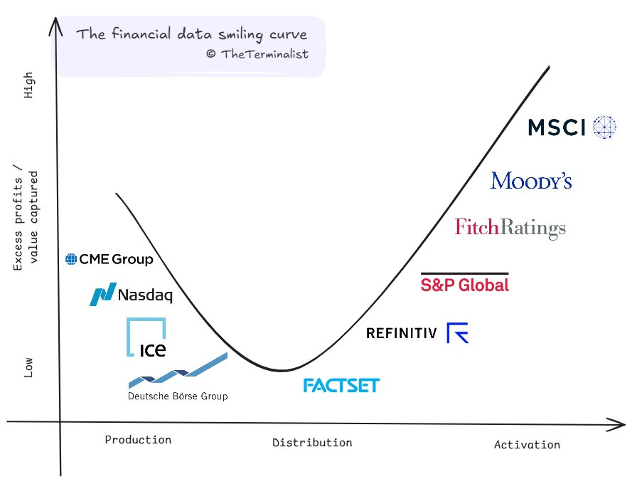
In 1992, Stan Shih, the founder of Acer, made a morose observation about his company. Looking at the computer industry, he noticed something striking: Acer earned razor-thin margins assembling PCs, while Intel and Microsoft captured enormous value through chip design and operating systems, and retailers commanded premium prices through brand and distribution. When he mapped these activities along the value chain against the value they captured, the resulting curve looked like a smile. Manufacturing - the middle of the chain - captured the least value, while design (upstream) and marketing (downstream) captured significantly more.
This pattern stands the test of time and has since emerged across industries that rely on the middle of the value chain for assembly, standardization and scale. Margins get squeezed in the middle, while the ends of the chain maintain pricing power through unique assets or intellectual property. But does it apply to the financial data value chain? If your intuition is tingling in the affirmative, you are in luck.
Smile to see who wins
And so, finally, the crux of this post and the focal point of many to come. Value capture in market data does indeed follow the smiling curve, and we'll look through some evidence to confirm it.
But first, some notes on reading this graph:
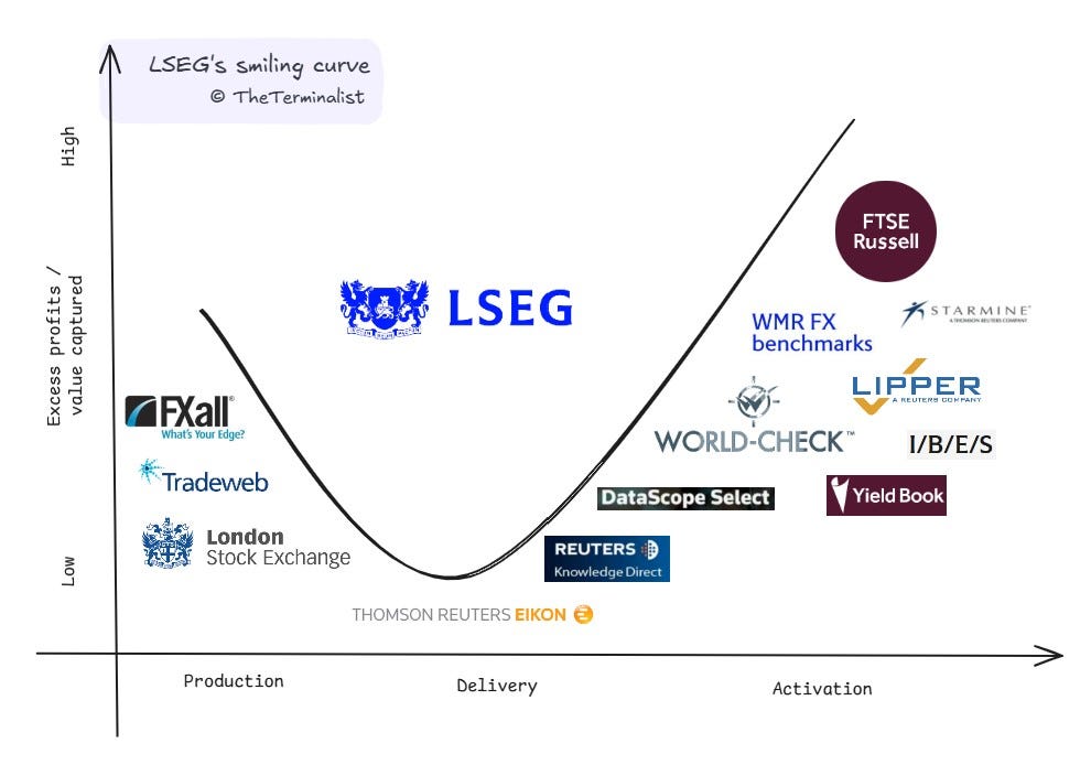
Two of the industry's largest players are conspicuously absent and intentionally skipped. BBG & LSEG operate across the value chain, making it difficult to place them at any single point. While Refinitiv appears on our curve (representing its pre-LSEG acquisition position), both these giants have built integrated empires with different assets representing each stage. At the end of this post, I've shared LSEG's assets plotted on the curve. We'll dive into them in a separate study.
The smile is asymmetric. The surface under the curve is greater for Activation than Production for two reasons -
Market structure - There is a finite set of primary data producers, most being exchanges. Exchanges are geographic monopolies by design. Barring the creation of a new asset class, this set size is relatively fixed. Activation doesn't face similar constraints. There is no upper cap on the number of ways to derive new value from existing data. The high scope of innovation attracts many new entrants, and the set size here is always growing.
Revenues - Most exchanges generate a large part of their revenue from trading activity, i.e. transaction and listing fees. For CME it's 90%. Data production (at 10%) is a profitable side business for now. In contrast, activators generate all of their revenue from activating data. So all their profits accrue under this curve.
The x-axis does not represent numerical values, so the curve does not run into a zero limit on the left. It can be extended towards the left or right as market dynamics change.
Positions on the x-axis represent each firm's primary focus, though some may operate across multiple stages to varying degrees. Positions on the y-axis are directional and relative to peers. Across both axis, focus is on the grouping, over the order or rank.
This framework, like any model, is a simplification of a complex reality. While it captures broad patterns in value creation and capture, individual companies may defy these trends through unique business models or market positions. Do share your perspectives on company placements or curve dynamics – this living framework benefits from collective wisdom.
The Evidence of a Pattern
Before answering why this curve exists, we should confirm its form and accuracy with corroborative evidence. Evidence that serves as a quantitative proxy of the excess value and profits on the y-axis.
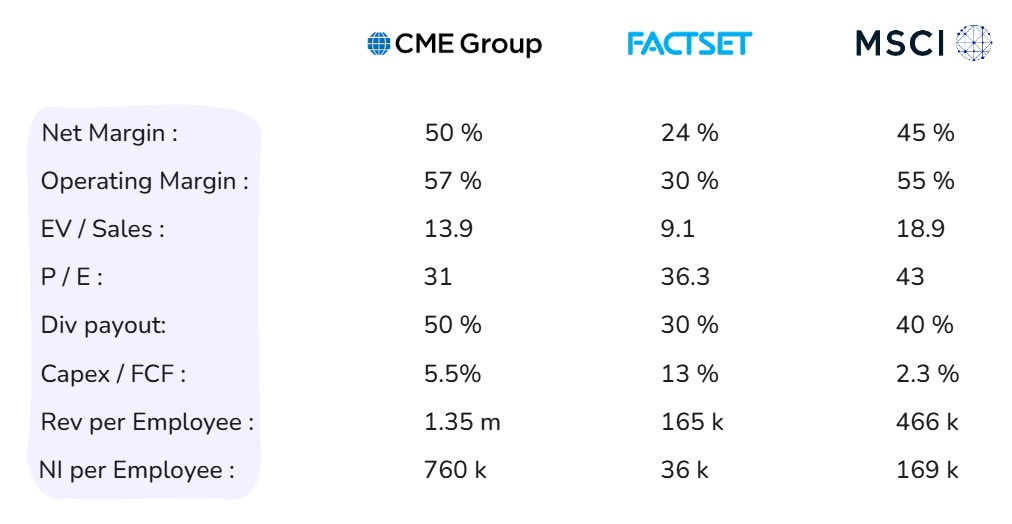
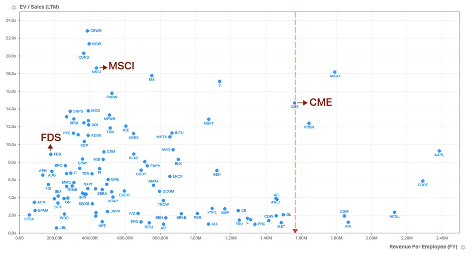
Let us start with excess value. What metrics indicate a higher ability to capture value in any value chain? Operating Margin & Net Margin come to mind. High operating margins indicate high pricing power, while high net margins reveal how much sticks to the bottom line. From a valuation perspective, Price / Earnings and Enterprise Value / Sales also come to mind. Investors tend to reward high profit generating capacity and consistency with higher valuations, all else equal.
What about excess profit? Total profit seems obvious, but it is a factor of scale and doesn’t make for a fair comparison by itself. It needs to have a common point of reference. Net Income per Employee instead yields a better comparison. And since we know profits can fluctuate more than revenue (from GAAP accounting practices), Revenue per Employee would be a prudent to include. Excess profits are usually reinvested back in the company, and if reinvestment needs are low, handed out to investors as dividends or share buybacks. A high Dividend Payout Ratio and low Capex to Free-Cash-Flow can indicate capital efficiency and signal excess profits7.
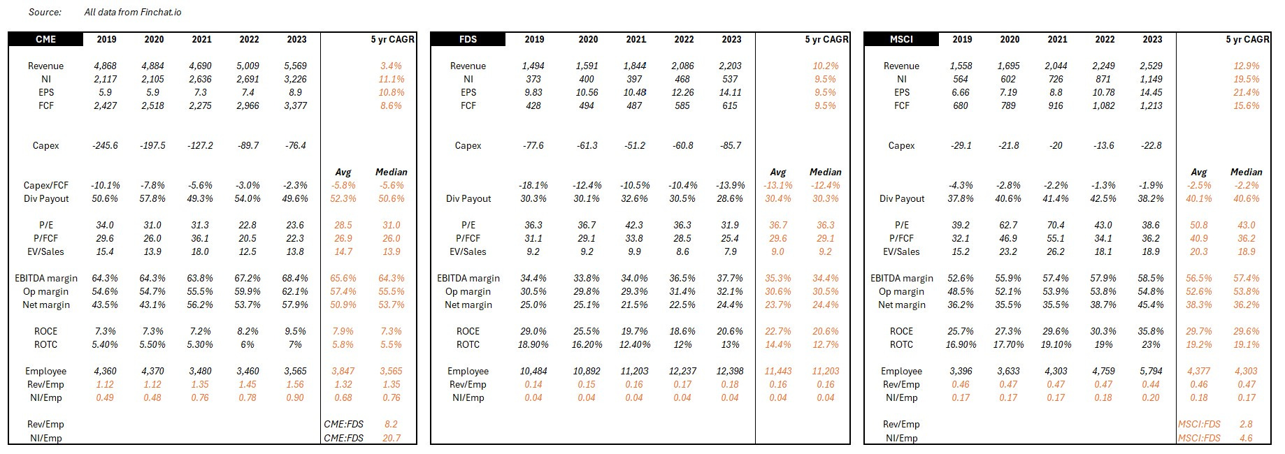
While more metrics can be used, collectively, these eight should sufficiently quantify the magnitude of excess value and profits being captured. To be even more prudent and not make conclusions from outlier data, we'll smoothen these metrics using five-year median figures (2019-2023, Source – Finchat.io). I've shared a copy of the working data at the end of the post.
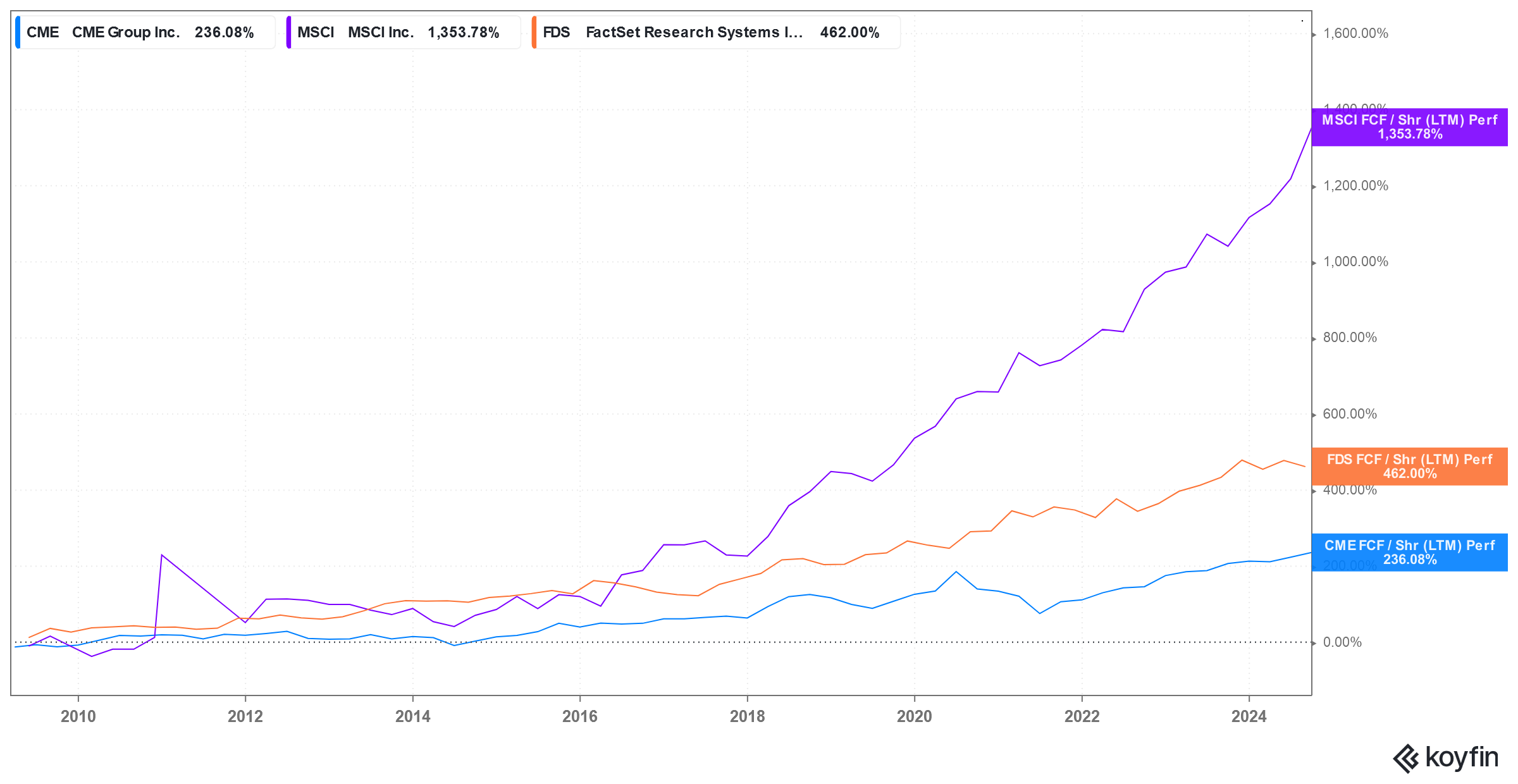
So, what do these eight metrics look like for our three pure-plays?
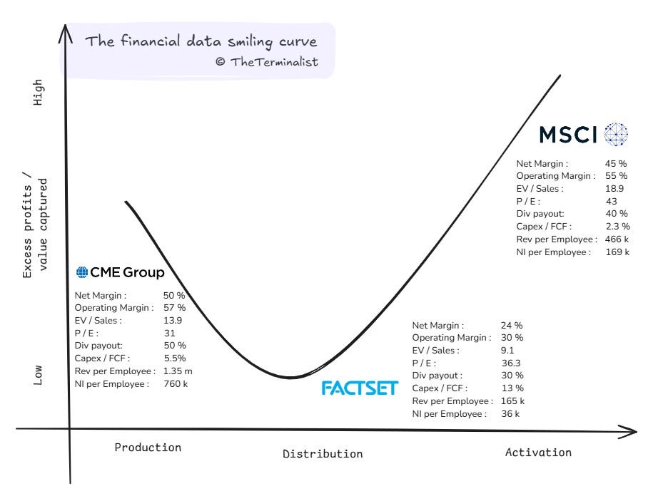
It is immediately clear that excess value is captured at the two ends, and limited value is captured in the middle of the bend. The data broadly confirms that the curve is true for market data. The only metric that tells a slightly different story is Price to Earnings. And there is a good reason for it, which we'll cover later. Here is a summary table for easier reference before we look at each of their economics a bit more.
CME and the production prerogative
CME is a stellar business. You best bet their employees get paid pretty well. After all, they generate more revenue per employee than many venerated Wall Street names and even Microsoft. Remarkably, they convert a lot of that revenue into profits. Each CME employee generates a net income that is 3.6x and 5.3x of a Goldman Sachs and a JP Morgan employee respectively.

Exchanges enjoy natural monopoly economics by design. There is a high regulatory burden to get licensed and high capital requirements to operate, and even if those two conditions are met, the cold start problem is very hard to overcome. Unsurprisingly, exchanges tend to be national and asset-focused. Once an exchange achieves critical mass in a particular market (like CME did in futures), traders naturally gravitate there for the best liquidity. More traders mean better prices, which attracts even more traders, and the feedback loop is hard to break (network effects) for any new entrant.
The strong network effects automatically drive revenue, significantly reducing the need for traditional operating expenses like sales and marketing. Ongoing capex is limited to tech spending that ensures necessary maintenance and gradual modernization of infrastructure. For CME, capex is to the tune of 5.5% of FCF. That is closer to other zero marginal cost industries, like Netflix (also at 5% capex to FCF) and well below traditional financial services firms like GS (12%) and MS (11%, all figures for trailing twelve months).
The 'zero-to-one-launch' capex and the 'one-to-ten-scale' capex for most exchanges have been capitalized and amortized long ago. The marginal cost to execute each new trade is zero, meaning transaction fees usually flow straight to the bottom line. Declining transaction fee per trade should be a concern, but have been more than offset by significant increases in trading volumes. Volumes may never be guaranteed, but thankfully, CME's growth constraints aren't geographically limited, even though the physical exchange is. It taps global supply and demand across asset classes and instruments for growth while not having to worry about new competitors.
Exchanges are in a unique position to double dip on monetization – transactions and data fees – giving them a negative cost of production for the market data. Combine it with low ongoing capex and opex in a regulatorily protected market with zero marginal cost to execute trades, and you have the essence of many data producers – high and durable profitability and margins. A strong form of excess value capture.
FactSet and the distribution dilemma
FactSet appears to have been caught with the bends. As with most industries where the smile curve is applicable, the value added is least rewarded in the manufacturing leg, i.e., the factory floor/assembly stage. A factory is judged for high consistency and efficiency, steady throughput with minimal errors and rapid time to market. The same applies to a 'data factory'.
FactSet's role, as we saw earlier, is to bring the world's financial data from every source to the end user in an accessible manner. A non-negotiable requirement of such a role, particularly in financial markets, is to do so with minimal error and in minimal time. In financial markets, either can cost clients their alpha. Viewed from this lens, FactSet is an error x time reduction function of the world's financial data. However, error and time reduction come at a rather significant cost.
Error reduction is necessary when error introduction is high. Drinking from every exchange firehose, collecting reference data in various formats and structures, processing all this data through multiple states of transformation requires a lot of processes and labor. Both open many avenues for errors to creep in. How does FactSet reduce error and time? Ironically, more supervisory processes and labor.
Using archivists and librarians, auditors and copiers, census takers and toll booth operators, each specific to the data domain, FactSet cleans, catalogs and concords data into end-user requirements. This strong need for human capital unsurprisingly drives labor offshore to manage costs. Two-thirds of FactSet's employees are in low cost centers – India & Philippines – toiling to meet accuracy and timeliness standards that drive their paychecks. To further drive margin growth, 80% of new hires are now exclusively in these two regions (page 37). MSCI and CME don't have similar disclosures, but some proxies can help highlight the labor intensity. MSCI's annual report reveals that India & Philippines represent just a quarter of their office space. CME's LinkedIn page reveals that just a tenth of its employees are based in low-cost regions in Asia. Despite the lack of offshoring cost advantages, MSCI generates 5x and CME 20x net income per employee compared to FactSet. The middle of the smile does extol a heavy tax, but at least it grants process power (and switching costs) in return.
Distribution is not just labor-intensive. It is also capital-intensive. We saw in the last post that it takes a lot of back-end infrastructure, processes and integrations to get data from source to client. Capex here adds up. Of course, automation, optical recognition, CSPs and machine-learning (and now LLMs) improve labor and capital efficiency, but each comes with high costs to adopt and deploy. So for most of it's history, FactSet was capital, infrastructure and labor-intensive. It continues to be on a relative basis, requiring 2.4x the capex to FCF of CME and 5.7x of MSCI.
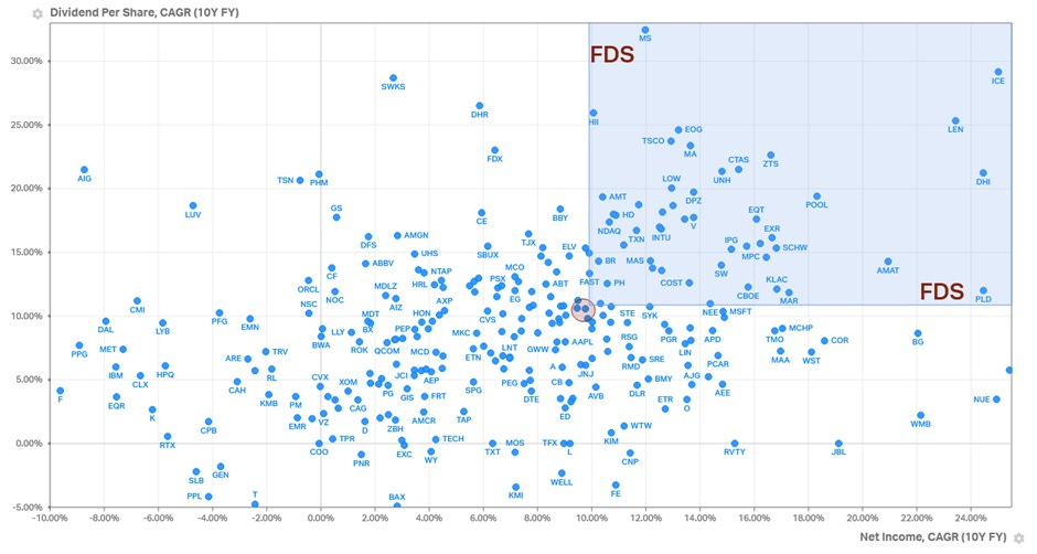
This does not prevent FactSet from being richly valued. While margins and profitability are constrained in the distribution stage, predictability and retention of earnings aren't. FactSet is 100% a subscription business with 95% retention rates. Dollar for profit dollar, a rational investor would pay more for FactSet's earnings over CME. Only by a slight margin though. Transactional revenue is still fairly predictable when you operate a monopoly.
FactSet's consistency in growth is impressive and spans many decades. Few companies can lay claims to 25 years of increasing earnings and dividends. Only possible through relentless cost optimization, decades of investment into adding process power and high customer retention rates. A prudent form of consistent value capture.
MSCI and the activation advantage
MSCI also sports high margins. They take raw data in as inputs and calculate various indices based on pre-determined rules and frameworks developed by experts. At its core, it's an Excel-grade algorithm that sums up all the prices of the constituents weighted by market cap and then averages them to a single figure. It can be done as often as needed (intra-second, intra-day, or end-of-day) and repeated on any basket of stocks selected to anyone's whims.
Of the three input variables – data, compute, human capital – only the latter cannot scale nor does it have declining unit costs. On a per-unit basis, marginal costs for data and compute are in structural decline. For MSCI, fixed costs are incurred to create an index and drive initial adoption. Then, marginal costs are incurred to calculate prices, not disseminate them.
As we saw earlier, scale effects allow an index to be created once and adopted by anyone, anywhere, indefinitely. Once an index hits critical mass (i.e. has minimal-viable-assets benchmarked to or tracking it), network effects kick in, and it becomes the industry standard. The licensing and data fees it can generate are theoretically uncapped, and past breakeven goes entirely to the bottom line. Fee generation is de-risked and stems directly from the AUM of the licensors, not their alpha or beta performance for the quarter. It is further de-risked as it is agnostic of active or passive investing. Both sides are equally monetized. The house always wins.
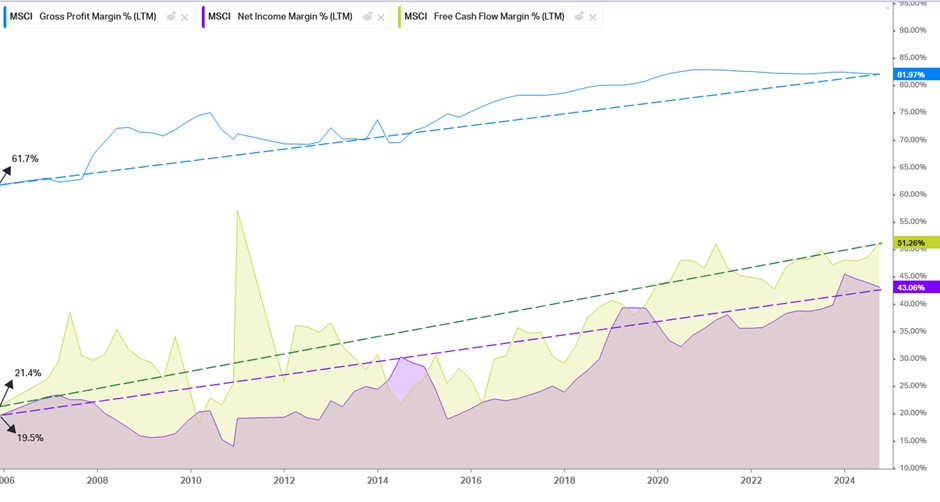
As AUM snowballs, so does margin as the impact of fixed costs disappears into history. Account for survivorship bias - most high fee-producing indices tend to be those still attracting or retaining AUM – and you have a vigorously margin-accretive business. Margins at MSCI have been on a 20 year climb. FCF per share has followed suit at an accelerating clip far outpacing CME & FactSet and driving valuations ever higher.
Of course, the biggest bull run in recent history (h/t the Fed) has contributed generously. But cyclical upside aside, MSCI is a bellwether of a business model. Even in a dramatic unwinding of the Fed or a recessionary reversal in the economy, valuations will (drop but) remain elevated over Production and Distribution. CME's transactional business is too reliant on volumes that disappear after a crash. FactSet has high fixed and variable costs that cannot be dialed down quickly when market data spend is reigned in. MSCI's business model comparatively has more margin of safety.
While less quantifiable, the last input factor is both the force multiplier and the only real constraint. That of human capital, the constraint is one of imagination (some say intelligence). This creative imagination originates all the defensible IP, that of proprietary methodology and selection. However, human capital is also why revenue and profit per employee cannot match CME's.
MSCI has a linear cost of human capital to achieve scale, specifically for various manual workflows that make up its operations - experimenting with new index construction, canvassing asset managers and buy-side to drive adoption, implementing AUM auditing & licensing fee collection mechanisms, negotiating fees on a client by client basis, etc. CME, on the other hand, can sit back and rely on network effects and high quality trade automation (paid for long ago) to do its bidding while contracts, fees, policies etc are mostly standardized.
MSCI shows that by activating data with IP, in a business that lends to network and scale effects, yields high margins and durable profits. Another strong form of value capture.
The power of position
The Smiling Curve shows that the three forms of value capture are created differently. Each occupies a unique position, draws from different strengths, is governed by separate constraints, optimizes on different input variables and monetizes to differing extents. Here is a simple summary table for reference. One that we will continue to build as we explore this industry.

This initial study of the three pure-plays points to a hidden truth -
Own the means of production or activation to extract most value, own the means of distribution and be compressed from both sides.
That is but a partial view and our work is far from over.
Partial view because each of the pure-plays have outperformed the S&P500 since their respective IPOs. By a significant margin and for extended durations. This outperformance isn’t stage specific. It appears industry driven, potentially industry native and warrants our further attention.

Our work is far from over as there are more truths to uncover. Truths that explain why this industry continues to outperform, why certain challengers have succeeded and why certain acquisitions were pursued.
Why did IEX and BATS initially succeed despite NYSE & Nasdaq dominance? Or why is Coinbase fighting tooth and nail for supremacy in digital assets?
Why was the UI layer in distribution long ignored? Why is it now seeing renewed competition - Koyfin, OpenBB? Why is Exegy consolidating the specialized distribution market (low-latency)?
Why has Activation seen the most category creation in the last 15 years - Kensho, Yieldbook, Quandl, Axioma, Risk Metrics, Sustainalytics? Why are none of them still independent?
Why did LSEG buy Refinitiv? Why does LSEG need to defend its strategic stake in Tradeweb and may look to acquire it?
Why are proprietary data assets all the rage right now - Burgiss, Preqin, Teegus, Pitchbook, IHS Markit?
Uncovering these truths could help point to future innovation and acquisition activity. Or if you are brave enough to bet on yourself, point to opportunities ripe for disruption where the odds aren't stacked against you.
Opportunities that can take the form of:
Creating new experiences of existing stages for specific customer segments (e.g. Finchat.io and Fey for retail distribution)
Developing specialized software that make a stage more efficient (e.g. Daloopa with data extraction) or specialized hardware (e.g. Databento with ultra-low latency networks)
Developing new and proprietary data assets (e.g. Messari for crypto research) or mining existing datasets in better ways (e.g. Quiver Quantitative with unique signals)
Rethinking existing models for new usecases (e.g. Pyth with multi-sourced, market-maker price aggregation) or rethinking existing usecases with new models (e.g. Estimize with crowdsourced buy-side estimates)
These examples are the tip of the iceberg. There are plenty more opportunities still waiting to be discovered. The smiling curve, through its simplicity, has a lot more to reveal. Today, we explored how CME, FactSet & MSCI create and capture value. In the next post we'll zoom out to understand each stage's DNA, its unique properties, economic structure and market dynamics.
We'll uncover if and where more constraints exist and why they matter. We'll understand why margins may not be as they seem and why all financial data aren't created equal. We'll appreciate the surprising cost of UI and the simple strength of a measuring scale. We'll draw from the shipping industry to explain asset-light and asset-heavy business models. We'll assess which stages naturally lend to new entrants and where category creation is structurally supported. And wrap this whole journey to appreciate how Bloomberg avoids getting caught in the middle and prints money by being a purveyor, packager and proprietor of data.
Thank you for reading this far. Again! I hope you found this post valuable. If the topics and questions for the next post pique your interest, you can encourage me to write sooner by sharing this with your network. New subscribers from your shares are the clearest indication of interest for continued deep dives into this puzzling industry. I appreciate the assist!
Edit: my next article is out! It looks at the role financial data plays in creating value across the three stages - how does Production benefit from price data, why is reference data so messy, and why does standardized data benefit Activation? Dive in when you are ready.
The Terminalist
h/t - Thomas, Didier, Pete & John for feedback on this post. While I’m at it, Abraham & Adam for feedback on the last post.
Housekeeping
As promised here is a glance at where some of the assets from LSEG sit on the curve. Let me know if it's worth a deep dive.

Fig 15. This isn’t exhaustive. If your are from LSEG and would like to complete this, get in touch. The underlying 5 year data set I used for calculating the 8 metrics sourced from Finchat.io.
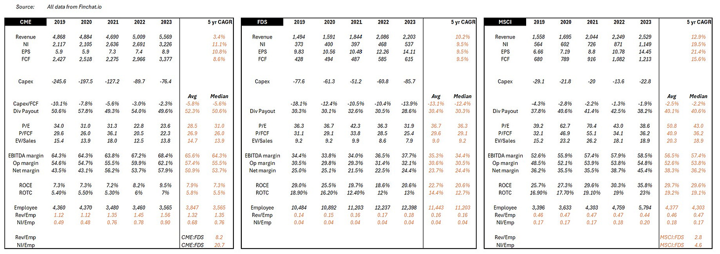
Fig 16. Someone should double-check my numbers If you were previously in the industry and would like to contribute your insights to future posts or support founders who read this stack, please get in touch. And if you are a founder looking for help from the industry, I’ll be happy to connect you with any industry inbounds I receive. My DMs are open.
If you are new, do check out my previous post on the Bloomberg Terminal that offers a deep dive into why it has been incredibly successful. If you want a quick summary of the post, here is one from an ex-Bloomberg executive.
And finally, if you don’t have anyone in mind to share this post with, show your support with a subscribe and like instead. If you are from the industry, I do welcome work emails. It helps me understand my readers a bit more. And if you are on X, give me a follow @TheTerminalist and retweet the post. Every little bit helps.
Essential Reading
Abraham Thomas, the founder of Quandl (exited to Nasdaq) shares a treasure trove of wisdom on the economics of a data business, and then continues that up with how to price data assets. I use the header essential rather than further reading to stress how foundational his writing is to anyone in the market data industry.
Auren Hoffman, the CEO of Safegraph shares his data-as-a-service bible that codifies a lot of the underlying nature of data companies.
Dylan Anderson, the mind behind The Data Ecosystem has been writing relentlessly on every data topic possible. His post on the lifecycle of data serves as a simple yet powerful explainer of the core concepts.
Why "Activation?" I think the term best captures the process of unlocking new value from existing data. Alternative terms like "Analytics" or "Processing" focus too narrowly on the mechanical aspects, while "Insights" or "Intelligence" overemphasize the human judgment component. Activation encompasses both the systematic and creative aspects of deriving new value from existing data – whether through computation (like index creation) or human interpretation (like research and ratings).
Financial news sits under Derived data as it draws meaning from and adds context to existing data. Without an investable security and its underlying instrument data, financial news coverage would not be relevant. CNBC or WSJ are not in the habit of covering news about non-investable companies that release no financial information. Who would be interested in that? Further, news is generated by reporters first, underscoring the need for human judgement/interpretation to produce it.
Computed and Interpreted Data aren't common industry terms. I've introduced them to help with simple classification and differentiate underlying properties and economics. Industry practice is to skip the computed-interpreted data layer and instead directly plug the four categories below into Derived data. The additional layer though is crucial in capturing the differing properties of computed and interpreted data.
Consumption by the user takes the form of an interface (human user) or feed (machine user), hence collectively, the application layer. Most references in this post are to the frontend / workstation / terminal for easier visualization.
I realize the irony of using an S&P index when explaining the MSCI business.
The IP here shouldn't be considered a cornered resource. The input (i.e.. raw data) isn't scarce, nor does MSCI have preferential access to it. The methodology is mostly public and replicable. Only certain parts of the final formula are confidential, for which substitutes exist. The IP draws from the methodology’s adoption at scale rather than the underlying data. As such, MSCI can make as many indices as it wants on any number of varying source data. No scarcity here.
We are not using dividend amount or dividend yield, as the former is absolute and the latter is price-based, and we have already looked at price in the P/E ratio. Share buyback could also be used. Feel free to look that up and see if it aligns with the curve narrative.
I think fewer than ten people in the world could have written this piece. My complements to the chef.
MOAR THE PPL NEED MOAR